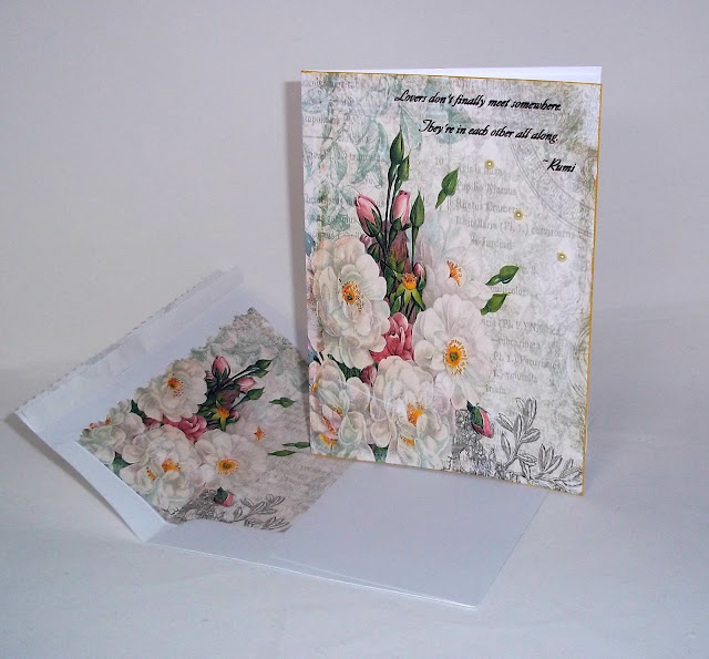
Hi All, I am hoping to get some help with this card. I love the gorgeous paper from Gecko Galz Garden Sonata Papers. I have added some pale yellow Liquid Pearls to all the yellow centers, and edged it with Inka Gold, but I thought it needed something more so I added the 3 pearls. What do you think? Do the 3 pearls take away from it? Any suggestions as to a better placement or something better to add? I would appreciate any help any one is willing to give me as I am stumped with this. I am in love with the paper though, that I am sure of! That's it for today, thanks for looking and thanks for helping too. ~Diane
Please join me by Banning Word Verification from your blogs, please be kind and choose comment moderation instead.

This is absolutely gorgeous, you don't need to alter anything, it is a wonderful card! Hugs, Valerie
ReplyDeleteThis is just beautiful!
ReplyDeleteThats a really difficult question Diane. Like you I love the papers and the sentiment and I also love the way the pearls reflect the circular shape in the corner. I don't think I would have thought of adding them, but I love where they are.
ReplyDeletehugs {brenda} x0x
Perfect!
ReplyDeleteWishes
Lynne
This is so beautiful and I agree the pearls are just the right touch to add a little interest, but not take away from the beauty! Love it!
ReplyDeletethis card is gorgeous, diane:) the pearls add a bit of dimension, i think:)
ReplyDeletePerfect just the way it is! The pearls are the perfect finbishing touch! LOVE the matching envelope, too!
ReplyDeleteHi Diane, I love it!! It is perfectly gorgeous. Love the pearls as they add a bit of texture. Beautifully created.
ReplyDeleteHave a great weekend.
Hugs, Celestina Marie
Diane, Gorgeous as always, do not change a thing.
ReplyDeleteHugs, Linda
Loving your gorgeous card just the way it is, Annette x
ReplyDeleteI have to agree with everyone else - the card is beautiful and I love the matching envelope :)
ReplyDeleteGreat Job as always ~
Gorgeous paper and the pearls are perfect.
ReplyDeleteMyrna
Simple and beautiful with just a touch of dimension. I'd say it's perfection as is. I think if you add anything more it will take away from the paper.
ReplyDelete~Deb~
Very beautiful and the pearls are a real bonus.
ReplyDeleteLove Chrissie x
Hi Diane,
ReplyDeleteThis paper is far tooooo charming to need anything else. The liquid pearls are just right and the inner of the envelope is super as ever.
Love,
M
This is fantastic! Very pretty!
ReplyDeleteThanks for visiting! I responded to your comment on my blog, too! I do hope to jump back into crafting. I'm thinking it will mostly be Art Journaling and Mixed Media. I'm going to catch up on your posts and project, girl! You're AWESOME :)
Diane, the card is gorgeous because the paper speaks for itself! This is where less is more - your card stands out in such a lovely way - you've done a fantastic job as usual. The matching insert of paper into the envelope gives it an even classier look! Brilliant creativity. Diane, thanks for always visiting my blog with your wonderful words of encouragement! Please know that I appreciate it so much! Have a wonderful weekend! :-)
ReplyDeleteOh no....I love the pearls! They look like little rays of sunshine! Thank you so much for sharing!
ReplyDeleteHappy day to you!
karianne
Diane, love that paper also and perfect sentiment. I have been experimenting with less is more for the last year and it is just now coming together for me, I have been doing such heaving embellishing for so long that the less just looks naked at times. The need to do this has come from the ever increasing additional postage for lumpy envelopes. You are on the right track though as I have found that wonderful busy backgrounds help a lot. I love the three pearls on this, a very stylish choice, like little dew drops, hugs
ReplyDeleteHi sweetie, this is just gorgeous, love your creation, hugs Pops x x x
ReplyDeleteDon't change a thing -- I was thinking a bow, but it would cover up that SCRUMPTIOUS paper and who wants to do that? WOW, what a totally elegant card and envie with that liner -- just think how blessed your recipient will feel when she opens this stunner!!!
ReplyDeleteThey say a good artist knows when to stop. Looks like to me you've stopped at the right place. Anyone should enJOY receiving this card. Lovely.
ReplyDeleteFabulous paper indeed - and for me the pearls are just the perfect touch. Very luxurious. It's a keeper, Diane. I've missed popping around - a little under the weather - so getting back to normal now. Always enjoy your beautiful blog! hugs, Donna
ReplyDeleteDearest Diane,
ReplyDeleteHere I am, Oh my this card is stunning for me. with those white roses are so beautiful. I believe that you no need to change nothing. Perfectly beautiful.
I love it so much personally.
Thanks so much for your support my dear Diane.
wishing you a great week
hugs
Oh honey, it is perfect just as it is. How beautiful! Mina
ReplyDeleteI LOVE this!! I think the 3 pearls are perfect...just the right touch. I really do love how you do all the liners for the envelopes! How many times have I said I am going to try that? Glad we are not keeping track...because I really need to try that!!
ReplyDeleteHugs
Heather
How lovely, Diane - it is one to be kept and treasured, goodness, the matching envelopes would be hard to part with as well.
ReplyDeleteThanks for showing - always inpsired when I manage to make it here!
Blessings,
Barb